Work: Tea and the Subway System
Here, just in case I need to prove that I am doing other things than experiencing ‘culture’ to pass my second year of University, I am posting up my last two projects for everybody to praise or put down.
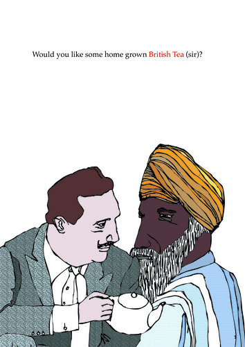
The illustration was kindly drawn by Amelia
The first brief was to create tea packaging and a promotional device to go with it. Whilst everybody else carefully chose a flavour of tea and an appropriate gimmick/gift to go with it, I, of course, was completely indifferent and ‘challenged’ the brief. If anything it was keep myself from going insane whilst sitting in front a computer choosing supremely life demeaning things such as font type and line width. So I decided to create a political tea; An English tea, grown in England to export to other countries to say sorry for all the people our Empire enslaved, raped, killed etc. Since this was yet another fantasy brief I decided to make it as fantastical as I could (within the constraints of the brief of course). If this was a ‘real’ brief and the tea was indeed exported to all those ex-Brit nations I’m sure the patronisation they would feel would start another World War. This however is a ‘conceptual’ tea designed actually for the British people who need to be educated (about all of us I would say). I wanted it to question the pride we feel about all those symbols that represent us – the lions, the cross, the innocent cup of tea. That innocent cup of tea that we are so proud to have represent us was founded on greed and blood. The strange thing is that this image has worked, somehow we have made it symbolise civility and sophistication. So basically I have created, yet another, piece of graphic art – not sellable, not for anyone really, but it’s got a ‘strong concept’ so everything else doesn’t matter.
Unfortunately the concept was so strong, so thought consuming, I forgot to visualise/realise it in anyway other than what I know i.e. simple, lots of white, not really ‘graphiked up’ in any way what-so-ever. I don’t really want to show the tea packaging because it’s quite boring, and I think you get the idea from the ‘too-clever poster’.
I think perhaps there is very simple scale to judge the success of a piece of graphic work by. If the person talks a lot, has to write a lot, explain a lot about what a piece is meant to mean etc – it’s a failure. The more bullshit, the worse it is. Maybe if everybody seems to be effusing pseudolectual semi-sense it’s the brief, or even the tutor(s) that need looking at. I mean look at my ‘tea to feel ashamed by’, this needed explanation, too much of it – perhaps then it is a failed project.
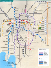
This is the most comprehensive Subway map of Nagoya I have found in English, but it's too geographically accurate
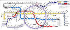
A much improved subway map, but it's only in Japanese.
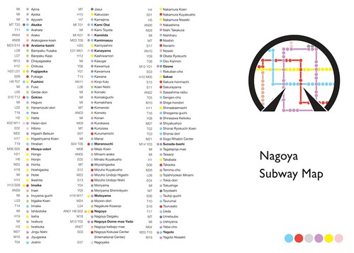
The outside of the Subway Map guide that I have designed
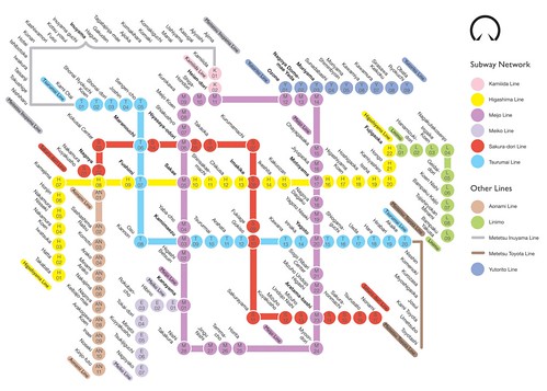
The subway map that I have re-designed (and improved upon).
However, this the second piece of work needs hardly anything said about it. I have made the Nagoya subway map more simple, more effective, English, and (la piece de resistance) on the reverse side there is a list of all the stations in ALPHABETICAL ORDER with station numbers and colours. Why don’t all subway maps have this? Are there too many stations? There is also uniformity throughout and none of the information overlaps. Needs a little tweaking here and there but altogether it’s better that anything else I’ve seen. It is influenced heavily by the Moscow Subway System Map. It’s a tad annoying I can’t write Japanese since it would make it even more perfect.
The thing is, it was a lot more fun creating the first project. The rail map was painful experience, getting the angles right, finding the right system, seeing how small I can make it. Then again, that’s what we graphic designers enjoy right?

The illustration was kindly drawn by Amelia
The first brief was to create tea packaging and a promotional device to go with it. Whilst everybody else carefully chose a flavour of tea and an appropriate gimmick/gift to go with it, I, of course, was completely indifferent and ‘challenged’ the brief. If anything it was keep myself from going insane whilst sitting in front a computer choosing supremely life demeaning things such as font type and line width. So I decided to create a political tea; An English tea, grown in England to export to other countries to say sorry for all the people our Empire enslaved, raped, killed etc. Since this was yet another fantasy brief I decided to make it as fantastical as I could (within the constraints of the brief of course). If this was a ‘real’ brief and the tea was indeed exported to all those ex-Brit nations I’m sure the patronisation they would feel would start another World War. This however is a ‘conceptual’ tea designed actually for the British people who need to be educated (about all of us I would say). I wanted it to question the pride we feel about all those symbols that represent us – the lions, the cross, the innocent cup of tea. That innocent cup of tea that we are so proud to have represent us was founded on greed and blood. The strange thing is that this image has worked, somehow we have made it symbolise civility and sophistication. So basically I have created, yet another, piece of graphic art – not sellable, not for anyone really, but it’s got a ‘strong concept’ so everything else doesn’t matter.
Unfortunately the concept was so strong, so thought consuming, I forgot to visualise/realise it in anyway other than what I know i.e. simple, lots of white, not really ‘graphiked up’ in any way what-so-ever. I don’t really want to show the tea packaging because it’s quite boring, and I think you get the idea from the ‘too-clever poster’.
I think perhaps there is very simple scale to judge the success of a piece of graphic work by. If the person talks a lot, has to write a lot, explain a lot about what a piece is meant to mean etc – it’s a failure. The more bullshit, the worse it is. Maybe if everybody seems to be effusing pseudolectual semi-sense it’s the brief, or even the tutor(s) that need looking at. I mean look at my ‘tea to feel ashamed by’, this needed explanation, too much of it – perhaps then it is a failed project.

This is the most comprehensive Subway map of Nagoya I have found in English, but it's too geographically accurate

A much improved subway map, but it's only in Japanese.

The outside of the Subway Map guide that I have designed

The subway map that I have re-designed (and improved upon).
However, this the second piece of work needs hardly anything said about it. I have made the Nagoya subway map more simple, more effective, English, and (la piece de resistance) on the reverse side there is a list of all the stations in ALPHABETICAL ORDER with station numbers and colours. Why don’t all subway maps have this? Are there too many stations? There is also uniformity throughout and none of the information overlaps. Needs a little tweaking here and there but altogether it’s better that anything else I’ve seen. It is influenced heavily by the Moscow Subway System Map. It’s a tad annoying I can’t write Japanese since it would make it even more perfect.
The thing is, it was a lot more fun creating the first project. The rail map was painful experience, getting the angles right, finding the right system, seeing how small I can make it. Then again, that’s what we graphic designers enjoy right?

<< Home