Tuesday, July 26

Osaka Festival

Here`s the festival I just went to in Osaka. It`s not that I`m a web junkie but honestly I have some time to kill before the train

Matured Gracefully

Emperor

Know My Name

The Lady Looked Twice

High Ranking Headwear

Pachinko

That last one is of the hypnotising Japanese pinball `Pachinko`

Saturday, July 23

Goodbye University

I wrote this as an emergency backup just in case I was too lazy to say anything before I go off. Not the deepest, funniest or most interesting of posts I'll be the first to admit:

On the honest – I am very glad university has finished. I was feeling the latter stages of claustrophobia and inevitable boredom setting in, for reasons I’m sure I might elaborate on later. Not that I’m ungrateful – I much rather be claustrophobic and bored in Japan than in Brighton.

I'm off on holiday for three to four weeks now doing that ‘love/hate tourist thang’, all around Japan. Maybe it’s because I’m from England which has the public transport infrastructure akin to Hell, but I’m really looking forward to catching a train tomorrow that runs on time. It’s not everyday that you get to ride on Japan’s biggest celebrity. The fact that it’s been dubbed the ‘Bullet Train’ doesn’t exactly turn me off either. Call me sad if you like but… actually, yes just call me sad.

Might be able to post pictures and things here along the way.

Here are some photos from being a tad inebriated last night. Cheap and easy amusement for you and me.


Pablo's Crotch.JPG

Sa-Chin.JPG

Hikari and Me.JPG

Tuesday, July 19

The How of The Exhibition

At last – the exhibition is up and the opening night has partied by. Having been here for several months perhaps you might think I would have developed some kind of day-rhythm, some system about creating work, but no, it didn’t really dawn on me that we had to put up something called ‘work’ until five days prior to the show.

Couldn’t I just have stuck up previous projects completed here in Nagoya, in fact, isn’t what they want? Mmm… recently created ‘graphic design’ in an art gallery – don’t think so. Would people be captivated alphabetical index on my subway map unless they were using it? Would people be astounded at the legibility but slightly ‘left-field’ edge of my business cards unless they were choosing someone for business purposes. Call me old-school on this issue, boring even, but the world is not full of GD anoraks just dying to see your choice of idiosyncratic text and it’s hierarchy. My work created in Nagoya was not about to reveal some truth about people and their everyday lives, ‘nor would it get them to think in a different way, and it definitely wouldn’t make them shed a tear, or break a smile. Sure you can put graphic design in gallery but it picks up all sorts of other connotations when it is removed from it’s context. Also certain works pick up artistic value along the way, such as movie or band posters, summing up a feeling or an era in people’s mind. Yes, of course I do believe design can transcend/become ‘art’, but definitely not mine here and now. I suppose I could have tried to communicate why my work was so brilliant and deserves to be classified as art – as it certainly is in my mind – but come on, try doing that in England let alone still strange Japan.

I needed to create something that I cared about, but other people could see and relate to for me to judge myself successful. Perhaps an advantage of studying graphic design over art when asked to present ‘something’ in an art gallery, is that you are aware of the audience, you do care what they think. (Sorry if you realise that all the following paragraph is all most probably paraphrased from both my lecturer, and Jean Baudrillard) You know that your ‘art’ is not autonomous, but in fact you are not shying away from it, you revel around in it’s heteronomy – you desperately want people to understand. ‘Good art’ is not what they, the critics and tutors say, nor is it what your father, friends or next-door neighbours say. I believe good art is like a mirror: you see yourself in it, you can relate to it, you can take from it. Good art is what you, and you alone, find resonance with, be that a bicycle wheel, a plastic straw, or blood. It is not Shakespeare, it is not Hokusai, it is not Picasso, unless you find something in it, something that you understand. What’s the point in teaching eleven year olds to love Shakespeare when they probably don’t know of the nuances of love, romance, tragedy and death. I now know that my art when I was young was lead-minatures, fantasy books, computer games, comics, anything judged to be middle-class and immature. I could relate to all of these things. I knew nothing of the ‘sophistication’ I was being taught in art class, in English, and indeed most other subjects, they just didn’t fit into anything I could comprehend. Now I am asking myself what was the point, what in fact do I remember from any of those lessons. Now with this in mind, I wanted to create an exhibition that people could in fact relate to and wasn’t so abstruse that it left people more clueless then when they walked in, but also I didn’t want it to be, you know, boring.

Ideas had been ambling around, lolling in and out of analysis, but I could not think of anything that had that illustrious ‘something’. I found the obligation of being asked (forcefully committed) to hang something in a gallery incredibly frustrating because finding something useful to say – especially if you are ‘not quite left field enough’ me – is a very pressing task. Blowing small nondescript icons up massive was one idea, but see above paragraphs as to why that was rejected (Andy Warhol’s ghost seemed disgruntled).

On the Monday of the same week of having the exhibition I was doing some absent-minded thinking where suddenly it seemed clear that I should take photographs of people increasing want to be removed from the senses of the ‘real world’. I thought about iPods, earphones, gloves, shoes, houses, air conditioning etc etc. This seemed like an okay idea which people from Japan or Britain could relate to. I wouldn’t usually question where such an epiphany comes from, but strangely the previous week I did two things: watched Dancer in the Dark starring Björk, and read the second chapter of Malcolm Gladwell’s Blink. Dancer in the Dark is a brilliant film where the central character goes blind and all sorts of nasty things happen to her. Chapter two of Blink talked about how we should trust gut instincts, and in many cases there is a logical way our brain deals these sixth-sense moments out. So perhaps the ‘back of my mind’ was figuring out my problem for me by looking at clues in my environment, namely Björk’s lack of sight portrayed so viscerally, provided me with the key to an idea. Admittedly I didn’t stick with this idea for long because it didn’t really inspire me enough, or indeed anybody else I told, but this idea sparked off another quick succession of concepts, one of which was ‘it’. Without that act of ‘procrastination’ I wonder where I would have been.

The final concept was talking about something that I am deeply interested in, but also is designed to be either funny and/or beautiful. Here’s the spiel I wrote for it:


Artists are Tourists…

I find that the behaviours of an artist are very much like that of a tourist – They exploit objects taking them out of context. Artists are also very likely to fall into the trap of liking something just because you’re meant to like it as told by other artists and teachers.

Being an artist I find that I am always looking for that perfect photo, I am not content with just a memory – I need proof of experience. Also in University, school and even friendship systems we are encouraged to display our ‘artistic personality’ through tangible things such as photographs, we are then judged against everybody else’s photographs. Is this what being an artist is?

Similarly, tourists are always looking for that perfect moment with their camera. They are also discontented with just a memory. Tourists usually think there is a need to prove their experience to other people – you know, pass around the photo album and tell a story.

Do you think that perhaps both the artist and tourist would get more from an experience if instead of taking photographs they thought about ‘things’ more e.g. the situation, the people, the ‘real’ experience, the meaning?

I am hoping this exhibition will show the similarity between two groups of people usually thought to be a world apart. Primarily I want this exhibition to make you laugh.

Art Paint Mess.JPG

Toilet

Doors

On the wall are a series of über banal shot of ‘things’, specially cropped and coloured to give an ‘arty’ feel (I did actually find most of them beautiful).

And on the side was a photo album of me being a tourist with the super-artzy locations and objects. Here is the second part of the text on the front of the album:


...Tourists are Idiots

As we all know tourists do the most stupid, disrespectful things when they are on holiday. This photo album is to show what I think a lot of artists attitudes are like (including mine). The results may look different, but the reasoning and the method may be more similar than first imagined.

Tourist is Art Mess

Tourists with Toilet

Tourists with Doors

Another Page from the Photo Album.JPG

Mmm…yes this idea could have done with a lot more polishing but maybe I’ll scrub it up nice, for a future soirée. I judge this exhibition to be a success not because my work was so astounding that you would suffer from Stendhal syndrome from looking at it, but because I furthered my understanding about how people work. I learnt which way round people are most likely to move around a gallery, what lighting people feel most comfortable with, and most importantly how they read work.

Like Roland Barthes said, (but infinitely more elaborately and eloquently) – people read, not how the author wants them to read, but how they want to read. People who couldn’t read English, could only be bothered to read halfway down my piece descriptions, or misinterpreted what I had said, all had different pieces that they took from my work. When asked about my work one person replied, ‘I have never seen a photograph of a toilet, and door in a gallery. I would never have guessed there was life with these objects and locations.’ So this person thought I was trying to show there was beauty and life everywhere you look, from toilet to door, to dustbin – damned that’s actually a more mature, better concept than mine. Needless to say I didn’t tell them ‘that’s not what it’s about’, I just agreed and said thank you. I couldn’t help thinking of that imbecilic phrase, ‘those who can, do. Those who can’t, teach’, rearranged and reworded to, ‘those who can, do. Those who can’t, take the piss’. Oh dear, I think I’m going to have to do some serious personal personality assessment.

If you would like to see all photos from the exhibition click here

A Page From the Photo Album.JPG

Spanish Speaker Looking at My Work.JPG

People taking Photos of Us Exchange Students.JPG

Saturday, July 16

Expo Revisited

This was written over an extended period of time and suffers from a lack of proof reading so please forgive the probable repetition and grammatical errors.


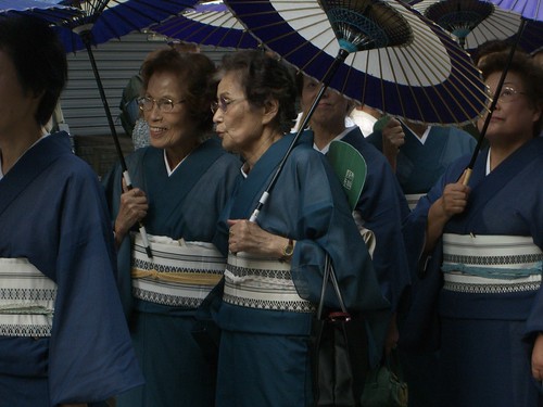
I think I understand the concept of the Expo more than last time. For those of you who don’t remember, Expo/Banpaku is huge theme park of every major country in the world – each with an exhibition space. The theme for this Expo is ‘the environment’, a burning issue indeed. The issue is no coincidence with the G8 meeting happening about halfway through it’s six month life span. The Expo website gives some spiel about the ‘guilt of Japan’, ‘Japan has modernised quickly at a cost – (cue sarcastic ‘dun, dun, dun’ interlude) THE ENVIRONMENT’. Quite ironically Japan is falling short of targets of the Kyoto global warming protocol. In emergency action Japanese government has said it’s okay for Japanese businessmen to go a bit more casual on the top button always done up rule. In fact at the expo there was a “Cool Biz Collection” fashion show June 5 at the 2005 World Expo in Aichi, with top executives — including Toyota chairman Hiroshi Okuda — strutting down the runway. This situation brings back disgusting memories of summer during my ‘wannabe private’ grant maintained all boys senior school, where we would have to wait until the first child would literally faint before we were allowed to take off our blazers and undo our top button. Japanese businesses have also been asked to turn down their air con. Easier said than done in 100 percent relative humidity and temperature averaging over 30 degrees c – as I am just finding out.

Perhaps it’s because the environment is such an issue in the press and with my peers at the moment, and perhaps it’s because I’ve been developing an interest in green technologies myself (and all the hippy stuff that goes with it) – but Expo has one too many contradictions in it. First of all Japan – yes great, robots that could potentially help the elderly, sweep the streets, even be security guards (the words ED-209 and Robocop mean anything to anyone?) but how does this bring to light the problems not just Japan, but the whole world faces? I mean the robots sing, dance, play instruments, but every article I have read about them simply states ‘wow – cool’. Okay, admittedly some go into how these machines can benefit society but none actually re-evaluate that ‘bigger picture’ and state the obvious that they are just another quick fix cure instead of the solution i.e. prevention. I mean where’s the profit if governments pump those billions into good education? Bush has already basically said that he’s not really going to agree on anything at the G8 summit because it would crush America’s economy. Instead he has revealed that America is looking more at ‘technologically based solutions’ i.e. something that investors and the military are going to get a return from. Also, Japan don’t really address the issue of wildlife (trust me they aren’t the only ones). I guess this isn’t surprising because the treatment of some animals by English, perhaps by extension, the Western world’s standards are pretty rough. Cat and dogs in tiny, sun warmed cages; Terrapins also in sub-sized cages, but easily reachable and shakeable by children; Siamese fighting fish in plastic cups. I know that I’m being naïve/ignorant for the sake of argument, but where do you draw the line when there is a clash between interest of culture and interest of environment? This has recently been brought up about Japanese increasing whaling for ‘scientific purposes’, and their promise to leave the International Whaling Commission if it’s demands are not met to have the whaling ban removed by 2006. All because eating whale is ‘part of their culture’ (and who are we to stop it?).

Next, Austria, who unashamedly had nothing to add to a sensible discussion about the environment, but saw this as a ripe opportunity to sell their country – and why not? There were a relatively large amount of people in this section of Expo, I wondered in and found out why. There was a man in Lederhosen pushing kids down a sizable ramp in, you’ve guessed it, a sleigh. I suppose it might be a green form of transport but like the curator was really thinking about that. Yep – we all cued up and had a go, and yep – it was fun. To make up for the total lack of any real information about any worldly issues, there was a seven by two metre wall of ice. Hang on – what did you say the theme for this exhibition was? I dread to think of the energy spent keeping a massive sheet of ice, 50 mil deep, frozen 24/7 for six months in what I have already stated is an extremely hot climate. I looked around for some reassuring information that this ice sheet was frozen using some impossibly envoi-friendly power source – no such luck. The kids, and the big kids loved it though. Despite Austria ostensibly being the bringer of many tonnes of CO2, it seems as though in terms of tourism projecting it’s image, it’s a runaway success with people ticking mental boxes of seeing all the stereotypes number one, two, and three. I was not the only person to be slightly perplexed by the display – an Austrian said to me quite sardonically when asked about their country at Expo, ‘and this is how we choose to be represented’.

South Africa at Expo

South Africa was a outlandish mix of (for me) interesting facts, and debatable statements. Side by side there was a model of a recently found fish, thought to have been extinct for 75 million years helping scientists understand the process of evolution, next to a passage of writing which went something like this, ‘We may have had our problems [extreme repression, violence, civil unrest etc] in the past, but now South Africa is a charming, benign place’. Admittedly I am near completely ignorant about what is really happening at the moment in South Africa, but having recently met a South African who just said casually, ‘yeah, three of my friends have been kidnapped… but that’s just part of life’, I don’t really think of it as this reformed, unattainable vision of Utopia that was being projected upon me. Throughout were the standardised, clean-cut graphics we are all so accustomed to seeing. Display boards were comforting in their familiarity: legible Helvetica-like font; big, clear high contrast pictures, cleanly juxtaposed; sweeping vectors of various shades of sandy yellow – you know the type – suggesting modernity and cleanliness. No matter what the information was about, politics, wildlife, tourism, ecology, economy, development, it would all be displayed in the same format. Never mind the aphorism written because – this place is clean, this place is modern. Is this what people want from a place like South Africa? Different (but the same) – (don’t you worry) we’ve got beautiful scenery (with coffee shops and all the stuff you want from back home). I believe that the cool and trendy display helped convince people that there is no real civil unrest, I mean how could there be in a place which has cutting edge (‘Western’) design. If this sounds ludicrous, then imagine a display from a country you know not to have the most salubrious of civil-political history’s, and then they state ‘everything’s alright now’ on cheap/poor/economy material, say an A4 piece of paper, printed on, put inside a plastic wallet. Who is more likely to convince you that they have turned their country around? There were in fact countries who did display information in this way, but I assure you they were rarely even read.

What is the alternative? As I mentioned in the last post about Expo – Mexico also used the ubiquitous ‘trendy display’. I criticised this approach and my Mexican friend didn’t agree at all, in fact he was extremely positive about Mexico’s display. I asked him what had the dry ice door, the darkened room with light box pictographic and typographic displays everywhere, and the seemingly arbitrary ‘hi-tech’ game which involved standing on squares to reveal wildlife pictures that corresponded with words such as ‘love’ and ‘happiness’ had to do with Mexico. He responded by saying, ‘at least their moving forward… they’re not using stereotypes’. This was a very interesting and complex counterpoint. So, is this ‘moving forward’, this ‘progress’, involves removing the country from what makes it unique, and appealing in the first place? Is progress displayed as adopting the most ‘progressive’ country’s ‘way’, or (dare I say it) ‘style’? Perhaps it’s unintentional – you want to display your country in a contemporary way, so you look at what is contemporary. Contemporary is Helvetica, it is interactive games, it is clean, it is simple, it is Ikea, it is interactive games, it is Pentagram, it is Western. Contemporary is tangible. Obviously, with homogenisation a lot is lost – identity, culture, personality, versatility, the idea of ‘local’ all suffers. But something surely is gained, is it not? Yes – (again) comfort in familiarity. If the reader thinks that I am giving too much importance to what is ‘just a display’, then again consider the same scenario with the A4 piece of paper in a plastic sleeve, and maybe some photos, just laid down on a table in no particular order. While this may appeal to a few artz types, I think the majority of people, who are on a whistle-stop tour of this country’s display having just come from ten other displays, and just before going to lunch may be more than slightly bewildered –having seen the ‘poor’ display they may even completely dismiss this country and go for lunch early. Here, a much less extreme example: a country who arranges type in the centre in a strange font as appose to on the left in Helvetica – do you think people are going to think, ‘that’s different to how we’d do it in our country. Maybe this country’s actually interesting because it does things in a naïve/endearing/different way’? Or are they simply going to think, however subconsciously, ‘this country’s poor and unprofessional’? Or given the exhibition situation, ‘I don’t have time to decipher this, I’ve got twenty countries to do before dinner’? While English remains the lingua franca everybody has certain conventions they will have to obey if they wish to be projected ‘successfully’.

Of course I half-joke about people’s callous attitudes towards this exhibition. I can hardly blame them with a one day ticket costing over £20 and with over eighty countries to experience – or rather ‘do’ – before the day is out including the must see bipedal robots (1+ hour queue inclusive). The exhibition has large multi-cultural headcount targets to be met, subsequently they set it up to attract a mainstream audience from around the world, hence the word on the street being that Expo is entertainment rather than education (not that in reality it can’t be both). Much like advertising in any form, the countries at Expo have to grab and fight for a persons’ mind-share. And like any mainstream advertising it has to be quick and easy to digest, with maximum impact in as little time as possible.

Perhaps the promoters of the Expo in other countries should have gone to same advertising school as the designers who created the display for South Africa, because even though it is meeting the expected numbers, they are falling short of the set 10% international ticket buyers. Perhaps this target letdown is because of their, to my foreign eyes, dubious use of ‘kawaii’, or ‘cute’, characters to be the hallmark of Expo – although this kind of marketing is highly successful in Japan (at times it feels like the only kind of marketing), I don’t see my Mum and Dad forking out one or two thousand to see an exhibition on the meant to be serious issue of the environment when it’s advertised using Kiccoro, the cute little alive shrub, and Morizo, the cute bigger alive shrub (the real meanings being: Kiccoro, the forest child and, Morizo, the forest Grandfather). The want to attract a larger audience and introduce them to our wonderful world is admirable, but the criticisms which are constantly levelled at schemes such as Live Aid/8 could certainly be seen holding true here i.e. it’s just a good day out, nothing more.

In a situation like found in the Expo, the content definitely seems secondary to the ‘ambience’, and design of the various sections. Mexico told me succinct fascinating facts like ‘there are so many thousands species of this, and hundreds of species of that, and this species is going to be extinct soon’. But what really caused this? What is really being done? Who is really responsible? One can argue forever if ‘style’ is indeed ‘content’, but whilst the über cool display was enveloping every piece of information in it’s style template, I don’t think that argument holds firm.

(Video of Britain’s contribution to Expo to go here)

Next stop: Britain. I wanted to know what it was like within the fantasy microcosm of my country. I also thought this might give me a relative value to gauge the afore mentioned countries’ authenticity (especially considering I have not set foot on any of them). I’m not an expert by any means on anything arboreal but there was definitely an alive Britaish woodland planted around the entrance path toward the building. It was more contrived than it would have been, but there was definitely a sense of ‘Made in Britain’ about it. I can hark back to those science classes and remember the scientific basics about how oxygen is produced from photosynthesis from leaves. And indeed I know that oxygen is important for living, as I know a lesser concentration of carbon dioxide in the atmosphere is more desirable for us sentient things. But really – digging up a patch of England and shipping it an impressive distance is hardly environmentally sound is it? However, my fellow Expoians were suitably stirred by this monumental display, as admittedly was I. This is when I realised that ‘Shaun, you are dense’: Which is more interesting – seeing the trees, seeing pictures of the trees, being told about the trees, or reading about the trees? Yes ‘depending on the creativity of the display, picture, narrator or story’ argument aside, seeing the actual trees is ‘generally’ more interesting and accessible. Which is more interesting and accessible – seeing something physical for example, the newest development in technology, or being told about how educational progress and new thinking in a country is helping people better understand ‘the environment’? In a situation like Expo I say GIVE ME THE ROBOT, but I suspect the latter suggestion is substantially more beneficial to people as well as the environment. The robot is easy to understand – for one thing it is tangible, it actually gives you something to display – it would hardly be groundbreaking if it was just a description of the robot and it’s functions. Yet with something so ethereal like ‘education’, ‘attitude’, and other hard to grasp concepts, that’s all it can be surely – a description, or perhaps some nice photos of happy people in a clean country, and who the hell is going to be impressed/entertained by that? I am not taking the moral high ground here – as I mentioned before I’m currently developing an interest in green technologies, but now I think investing mind-share in this area is the ‘easy way out’, it’s just maturation of that adolescent geek that never died (with a sprinkle of university eco-liberal-awareness for taste). If I invested just as much intellectual resource in really trying to understand the ‘tick-tock’ of people, really trying to teach people these values it would be a lot more beneficial for both humanity and the environment. But that would be more difficult, and at the moment I am just trying to scrape over the ever-taller hurdles of a degree.

Ah the heady mix of delusion and digression.

Engish Totem Pole??

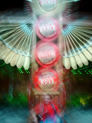
The illusion of sweet oak-filled Britain was then shattered when I ran into the first ‘man-made’ display (ha). I really have been trying to think about this one and give it some leeway in my mind but I can’t – The first ‘piece’ (well it’s almost ineffable) was a raised wooden pillar not that dissimilar from a totem pole, with singular wooden seats embedded at either side. Running up and down the pole on circular disks were arbitrary British names such as ‘Ross’ and ‘Agnes’, with equally random dates below. I’m not sure if this was meant to reflect the importance and the celebration of the everyday person in Britain but I assure you me, and my British friends were in bemused fits of laughter.

Video of Britain at Expo
click here to see video

The Inside of the show was completely different – very dark with backlit cut outs in the shapes of leaves on the wall – trying to ease the transition from British forest, to totem pole, to trendy darkened room I imagine. Initially I felt very happy and envious for the graphic designers who got to do this display, exactly the ‘kind a thing’ I like – it was utilising technology to create a more interactive experience, a similar ‘style’ of exhibition can be found at the Churchill Museum, London (art directed by 
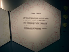
Nick Bell). First I was presented with a pendulum like dongle, I stared at it, then I child more curious than I pushed it and instantly a buzzling noise was produced and lots of things followed the dongle around in an appropriate bee like motion. However, these were no ordinary bees, they were small buzzing letters – bees made out of the letters B E E – how wonderfully charming for both the graphic designer and the participant. The information on the display board on the reverse of the bee game stated that we have borrowed the hexagonal honeycomb structure to create stronger structures. In a nutshell – we as Man have borrowed and learnt from nature. The information was very light but I still had a feeling of ‘Oh yes, very good point Britain, nice clever way of fitting into the Expo without resorting to The Queen or Buckingham palace’. I can forgive the fact the interactivity is nothing to do with the structure of honeycombs and is slightly facile but hey, good use of a cultural trademark, looking forward with a nod to the past – I liked it.

Next I read about how researchers and developers at such and such a university have created a super near-frictionless swimsuit from looking at the structure of shark’s skin. Okay, the information again was about fifty words long but still forgivably shallow. Unfortunately the accompanying ‘cutting-edge’ interactivity really helped me understand how thin Britain’s educational contribution to Expo really was. It was beyond inane – there was a computer-generated shark in water with an outline of a hand waving over it. I followed the motion of the outline with my hand and guess what, the shark really moved – wow! I could have almost forgiven the dreariness of the game were it actually related to the understanding of the structure of sharkskin. Strangely what really peeved me was not the disjuncture between parts, but the fact that the animal on display had nothing to do with Britain really at all. I understand that I may be running into the illustrious land of hypocrisy from admitting that I actually want to see some kind of stereotype, but really a shark (not even a semi-native such as a basking shark I may add)!

The next display was in a similar, but even worse vain – learning how to make strong sticky stuff from gecko’s feet. The interactivity involved rotating an object to make a silhouetted gecko crawl over the famous London landscape – happens all the time didn’t you foreigners know? This one was perhaps the most objectionable despite, being momentarily appealingly, ironically surreal. Why didn’t they have an interactivity displaying what this technology was actually useful for? They could have displayed how people could scale walls by actually becoming nearly molecularly bonded with whatever surface they are touching – they could even have used, for posterity’s sake, the Gherkin or Saint Paul’s. Wouldn’t that have been more relevant, interesting and entertaining?

Oh Britain and the Expo

Just before the exit there were these annoying, tacky looking honeycomb shaped information boards (as though acknowledging that the only English animal referenced was the bee). There were also some viewfinders with backlit pictures of the picturesque rolling hills of the Cotswolds, the Yorkshire Dales etc etc. For me, backlit displays in viewfinders can only look so natural.

Even though I was dissatisfied with what Britain had shown me, I still think it was a (relatively) ‘successful’ display. People seemed wowed and amazed by the novelty of interactivity of the displays. I am sure that people who weren’t trying to squeeze some kind of research project/dissertation out of this would spend those five minutes with their friends and their families and be entertained, might even buy some of those Walkers’ shortbread biscuits, and most importantly the status of ‘Britain’ would be elevated in their minds. Perhaps, if the information were to go deeper then people children would become restless and people would be quicker to leave. Nevertheless, the reason why I am excited by the use of new interactive technology (apart from that ‘geek-streak’) is because it should allow an easier understanding of a complex subject. With the evidently big budget in Britain’s show I feel the graphic designers and ‘they’ (whomever ‘they’ are) missed a really good opportunity to show what technology can help to do – be inclusive, cross language and age barriers, be entertaining AND educational. Instead of Dumbing-up, the designers and ‘they’ took the easy option and dumbed-down. The content of this display reminded me of is in my foundation course when I was first getting to grips with software packages such as Photoshop, critiques would consist of me simply demonstrating what I could ‘do’ with it rather than the content. There is a power that comes from novelty, and I believe Britain missed a prime opportunity to showcase how clever and dynamic it can be.

London in Japan.JPG

Covent Garden Haircut.JPG

Having been to my ‘home-country’ I could now understand what my Mexican friend was saying about Mexico. It was refreshing to see Britain not harping on about ‘the glory days', and misappropriating and 'moderninsing' icnoic images – for example the appropriation of the London Underground sign in the pictures above. The problem is that, that is what people want to see and if you don’t provide that then people are going to be disappointed. We rely on stereotypes to keep a sense of identity, and if your identity is successful it is a highly profitable business. When I visited the Mexico section it provided me with exactly what I didn’t want to see – hardly any of these cultural trademarks were present. Sure I want Mexico to be ‘advancing’, but I want it to be more rugged than Britain, I want there to be desert, I want it to be filled with Cacti, I don’t want to see a computer, I want to see happy smiling people drinking under sombreros. And instead I was provided with something cool, calm and too technologically enhanced. If a country removes itself from what it is expected to be, what does it become, something new, or something the same? A Taiwanese friend said England was ‘cool’, and I came away asking myself is this a good thing?

The bridging of the gap between theme park and environmental issues for all ages is an admirable, if ludicrous concept. Especially when there are ulterior motives such as tourism and money involved. Does the Expo encourage good international relations, or with it’s up-beat, almost politic free, ‘progressive’ feel does it make the world seem somewhat utopian and problem free? All these pressing questions and no real answers.

Tuesday, July 5

I Admit It – I'm Bored

My girlfriend’s gone to Tokyo to do some meaningful research and probably have fun without me

I had an Argument with my girlfriend

The forced friendship group of all the foreigners has, at last, disintegrated into disparate parts

I have finished all my good books

I have only crap books left

Rainy season is very much living up to it’s unambiguous title

It’s also really hot

I’m bored

I have an exhibition which I don’t want to partake in

I bought a new camera not because I needed one, but because I get £100 from Uni to spend on ‘materials’ and I sold my old one to Amelia. I thought I might as well

I think the camera has a fault so there went retail therapy

My bike is broken


All of the above contributed to me not having a very productive week at all (I had all these plans and everything). There has been a break in very consistent downpour today so I took the opportunity to test my maybe faulty camera. Here are most of the results:

So Many Colours

Old Dead Kitty Detail

Hyper Banal View of Appartments

Umbrella Meet Pipe

Peace Glove

Power Hungry

Yukata day

The Cleaners

Thursday, June 30

Tourist Rightly

The only time in recent memory when I have been a tourist proper, is when after cycling for a long time down to Spain with my girlfriend, we were grounded in Barcelona due financial difficulties (we couldn’t afford the flight back from anywhere else). I hated it – we were just another member of the trapped, dumb herd, following instructions dictating to go from hither to thither. It was claustrophobic, frankly boring experience never to be repeated. But of course time is the greatest enemy of truth, and I am in Japan – I had to go to Kyoto sometime.

Despite the scenery, almost hypnotic notice boards, and the pre-placed tourist entrapments, the most enthralling of all the arts (natural or otherwise) are the people in uniforms. Every one of the Artz students here has asked at some point or another to take the photo of the humble driver, conductor, information clerk, maintenance man – they are just so appealing. The living monuments, the embodiment of what is Japan. It’s not the photos of the temples, or the angular perspective ambience shot you look forward to seeing, it’s the one of Joe…(sorry)Akira Blogs standing by his equipment in his spangling uniform. Look at all the www. social photo sharing services, generally what are the most viewed photos – the one with highly evocative lighting illuminating an ambiguous object, or the one of the crazy smiling happy person? I save this digression for a later date.

Japanese Tourist Attraction

Amelia and I marvelled at the maintenance man at the platforms edge at a station South of Kyoto.

A Sneaky Couples Photo

Kyoto, I thought had to be better than Nagoya i.e. it had have an element of life, other than human to it i.e. it actually had to have a patch of grass. The assent to the top of Kyoto station felt like a disembodied experience, with escalator upon escalator facing the very light, pallid sky. At the top was a garden (A GARDEN) grass inclusive, but it had that element of Japanese beauty that I was certainly not craving. It was simple, it was balanced, but as far as I was concerned it was simply an overtly contrived plasticy building. My feeling was definitely in the minority with some Japanese people serenely meditating, or asleep, or quietly contemplating. I also hoped the view of Kyoto to be something different to what it was. Surrounding the garden was high, thick glass revealing the city as yet another, Nagoya-like, grey urban jungle, with little space to exhale; however, the mountains were both tantalisingly, and frustratingly close.

Kota Looking Cool (as usual)

Kota – our friend and guide – had the whole day planned out for us. Temple after temple was the basic agenda. The first temple we entered had a disappointing surround, but inside was very interesting. Hundreds of gold statues were placed in a dazzling symetitricity. In front of these were about thirty Gods, each with a description of who and why they were. I have never been an immensely in-depth history or religion buff so it surprised me that virtually everything I read said, very basically, Chinese Buddhism appropriated a lot of their deities from Hinduism, and Japanese Buddhism appropriated from Chinese Buddhism and Hinduism. I was surprised that this was the case, but I was more surprised that they were so forthright with it. Don’t the Japanese Buddhists feel slightly cheapened by their ‘adapted’ religion? I know Christianity is the same story, but that’s my point. Every religion has based its ‘model’ on other, previously existing religions. Don’t Christians, Muslims, Sikhs, Buddhists, ever look at what was before them and question the divine truth, authority, authenticity, and originality that their own texts seemingly elucidate? As I’ve said before – what do I know?

No Photos in All the Best Bits

Anyway, I wasn’t allowed to take photos – understandable, but annoying. There were more fascinating facts and accounts about the temples history, but I could feel the invisible pull of impatient friends waiting outside. Outside, one of my friends said that ‘she didn’t like it, too much like a boring museum’.

Temple Walkway

Us at a(nother) Temple

After lunch we headed to another temple near the mountains. This one was a lot more ostentatious with its colour, set in a lot nicer surround, but somehow more unpleasant. The sources of my discomfort were my simian brethren – the Americans, the Deutsch, the Indians, the Japanese – the people. Everyone taking photos to prove their holiday happened, creating and sealing that now forever happy moment. The ‘been there, done that’ culture that seems to be in all our bones. Oh yes, we all did it as well, the urge is completely surreptitious and unavoidable – ‘we were there, we smiled, we created the memory’. This time I was the one pulling the group with the invisible leash of dissatisfaction. This place would have been perfectly beautiful were it not for the smash of the city so close, and the people like my friends and I. Still, without our constant souvenir/proof of experience buying, I don’t know how long such a multitude of temples could survive.

Maiko

Later on that day we wondered around fascinating small streets where they sold those ‘traditional goods’ for the tourists – we tried every sweet taste you could conceivably make from some natural flavouring and some bean paste. A friend and I also tried tiny, dried baby fish – it was interesting picking whole fish from between teeth. Then we saw what every person who visits Japan wants to see – a Maiko or Geisha. We all used the part of the mind responsible for respect and didn’t ask her to stop and pose for a photo.

For me, the best part of the day was sitting down in a café watching the people go by with their distinct sense of de rigor. Guessing the lives they lead, spying on them for the ten seconds or so, them completely oblivious to me. Also we all got to put our feet up, of which we were more than grateful.

A Japanese Horror

That night Kota went home and we stayed in a unique and cheap travel house which reminded me of many a horror movie. That night I found myself defending ‘Japan’ against a barrage of complaints made by a friend. It was a strange debate involving comparisons of first hand experiences in different cultures, and third hand stereotypes of others. The whole debate twisted, turned and degraded into something else entirely as any overtly emotional, uninformed, unfocused discussion does. During in that time I heard myself saying diplomatic (‘weak’) things such as, ‘any culture is as interesting as any other culture, it’s all about trying to see the reasoning behind its development’. As I played back the nights conversations in that introspective stage I often arrive at when my mind is meant to be gearing down for sleep, lying in my bed I found myself asking myself should I be defending something I know I don’t agree with? Other such portentous questions plagued me in that twilight zone, but eventually I just gave up and went to sleep with stereo snoring beside me (thanks Pablo, and thanks Mr. American).

Shrine Devoted to Animals

Detail of Weather Mutilated Statue

The next day we rented bikes that were cheap and that worked. Just. I really enjoyed being back on a two-wheeled freedom machine. You know, the wind through your hair, to be afforded an amount of therapeutic caprice, and all that stuff. Again though I could feel the anchor of other people dragging behind. I felt the pressure not to get lost, even though that’s all I wanted to do. We found our way onto the enlighteningly named ‘Philosophers Path’. Stumbling onto a lot smaller, less ornate, but infinitely more enchanting temple. There was only one other Japanese person there, it was at the foot of the mountains, and it was quiet. Sorry, it was quiet except for us – The Tourists. We were clad in the traditional dress of The Tourist – bags, sunburn, and inappropriate clothes. We also spoke in the traditional manner – loud, disrespectful, and dumb. I felt sorry for the lone Japanese person who was hoping to receive peace. For us though, it was an atmospheric and semi-spiritual experience.

We carried on along Philosophers Path to another bigger, famous temple but found out that we had to part with more cash so we went to the hidden, but I suspect nicer, free, subsidiary temple close by. Exactly the same thing happened – the person from the first small temple had chosen the same route as us. Sure enough, there we were sprawled, perhaps disrespectfully, perhaps not, along the various stairs. She left very quickly.

A Japanese Fine Art Garden (literally)

Everybody followed the erratic path I created with my bike and my compass. I tried to make the route interesting by keeping to the smaller roads, but instead I think that I aggravated some of my friends who just wanted to get to the next destination. We bought some food and stopped at a ‘Fine Art Garden’ to eat it. Maybe we should have known, through over two months of experience, that it wasn’t going to be what we were sure it was going to be. No – it wasn’t a beautiful garden created by Japan’s finest horticulturalists, artists and landscapers. But yes – it was a concrete area flowing with water with life size replicas of various famous pieces by Michelangelo, Monet, and the like. There was one really very interesting faux tapestry (printed into a hard surface like concrete) showing life – the technology, work, architecture etc – in ancient Japan. We promptly exited the ‘garden’ and sat on the small area of grass just outside to eat our food. Whilst eating we could see next to the Fine Arts Garden was actually a beautiful ‘real garden’ with flowers, and grass inclusive. Quite infuriatingly the entrance fee was separate for the neighbouring ‘Art Garden’ and garden of art.

Exactly Like it Said

Appropriately, as I am running out of vigour, and adjectives for this entry as I come to the section where I was running out of will to see anymore man-made places of ‘spirituality’. We went to probably, supposedly the most impressive of all temples Rokuon-ji. It was beautiful, all painted in gold but I don’t think I really ‘got’ anything from it. Everything was fenced off telling you where a respectful distance was, it even told where a good photo spot was (obviously the buildings flattering side). What’s the point in something being a major World Heritage tourist attraction if no one but a few in the World can truly experience and enjoy it? Especially when they charge an entrance fee!

On the train home I pondered more about things and those things connections to stuff. Despite making Kyoto sounding a bit hellish I did have that retrospective general warmth of ‘yeah, that was a ‘good-time’ wasn’t it?’. Perhaps I’ve just I realised my hypocritical approach to travelling, and I was angered by myself. But maybe I should just go with the flow, appreciate my position more and take advantage of it. Yep.

Monday, June 20

Work: Tea and the Subway System

Here, just in case I need to prove that I am doing other things than experiencing ‘culture’ to pass my second year of University, I am posting up my last two projects for everybody to praise or put down.

Home Grown Tea

The illustration was kindly drawn by Amelia

The first brief was to create tea packaging and a promotional device to go with it. Whilst everybody else carefully chose a flavour of tea and an appropriate gimmick/gift to go with it, I, of course, was completely indifferent and ‘challenged’ the brief. If anything it was keep myself from going insane whilst sitting in front a computer choosing supremely life demeaning things such as font type and line width. So I decided to create a political tea; An English tea, grown in England to export to other countries to say sorry for all the people our Empire enslaved, raped, killed etc. Since this was yet another fantasy brief I decided to make it as fantastical as I could (within the constraints of the brief of course). If this was a ‘real’ brief and the tea was indeed exported to all those ex-Brit nations I’m sure the patronisation they would feel would start another World War. This however is a ‘conceptual’ tea designed actually for the British people who need to be educated (about all of us I would say). I wanted it to question the pride we feel about all those symbols that represent us – the lions, the cross, the innocent cup of tea. That innocent cup of tea that we are so proud to have represent us was founded on greed and blood. The strange thing is that this image has worked, somehow we have made it symbolise civility and sophistication. So basically I have created, yet another, piece of graphic art – not sellable, not for anyone really, but it’s got a ‘strong concept’ so everything else doesn’t matter.

Unfortunately the concept was so strong, so thought consuming, I forgot to visualise/realise it in anyway other than what I know i.e. simple, lots of white, not really ‘graphiked up’ in any way what-so-ever. I don’t really want to show the tea packaging because it’s quite boring, and I think you get the idea from the ‘too-clever poster’.


I think perhaps there is very simple scale to judge the success of a piece of graphic work by. If the person talks a lot, has to write a lot, explain a lot about what a piece is meant to mean etc – it’s a failure. The more bullshit, the worse it is. Maybe if everybody seems to be effusing pseudolectual semi-sense it’s the brief, or even the tutor(s) that need looking at. I mean look at my ‘tea to feel ashamed by’, this needed explanation, too much of it – perhaps then it is a failed project.

Nagoya Live Map
This is the most comprehensive Subway map of Nagoya I have found in English, but it's too geographically accurate

Nagoya Subway Map (Japanese)
A much improved subway map, but it's only in Japanese.

My Nagoya Subway Map Outside
The outside of the Subway Map guide that I have designed

My Nagoya Subway Map Inside
The subway map that I have re-designed (and improved upon).

However, this the second piece of work needs hardly anything said about it. I have made the Nagoya subway map more simple, more effective, English, and (la piece de resistance) on the reverse side there is a list of all the stations in ALPHABETICAL ORDER with station numbers and colours. Why don’t all subway maps have this? Are there too many stations? There is also uniformity throughout and none of the information overlaps. Needs a little tweaking here and there but altogether it’s better that anything else I’ve seen. It is influenced heavily by the Moscow Subway System Map. It’s a tad annoying I can’t write Japanese since it would make it even more perfect.

The thing is, it was a lot more fun creating the first project. The rail map was painful experience, getting the angles right, finding the right system, seeing how small I can make it. Then again, that’s what we graphic designers enjoy right?